
Embarking on a compelling exploration of digital sustainability and design, our mini project delves into the intricacies of fostering an eco-conscious approach in the digital realm. Within a limited timeframe, a dynamic team, where the frontend was spearheaded by myself, converged to craft and bring to life a succinct React site.
At the heart of this endeavor lies the vision to furnish a user-friendly guide, serving as a beacon for teams venturing into the uncharted territory of digital sustainability. The overarching goal is to equip novices with the requisite knowledge to forge a path towards a lower emission digital presence. Our meticulously curated site encapsulates ten tangible and actionable considerations that teams can implement immediately. These insights form a foundational framework, propelling the journey towards a more sustainable and environmentally responsible digital landscape.
Built with HTML, Tailwind CSS, React.
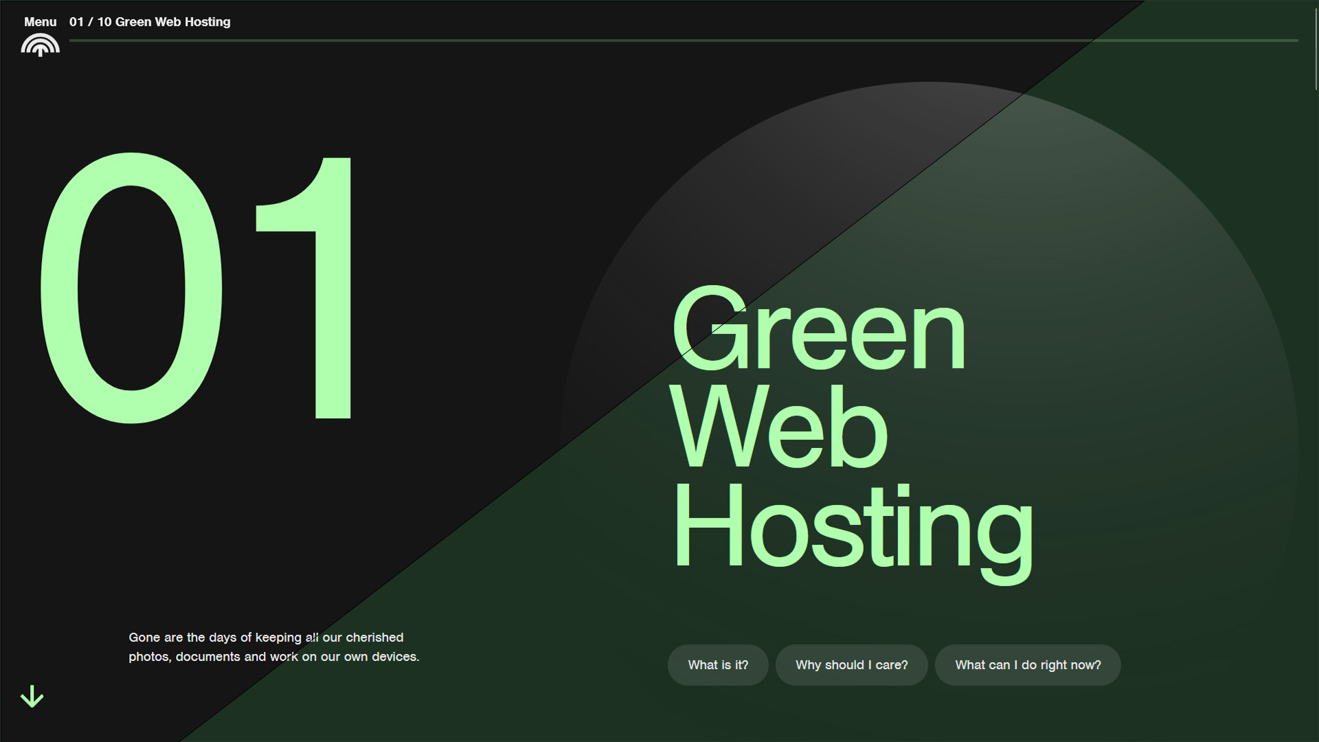
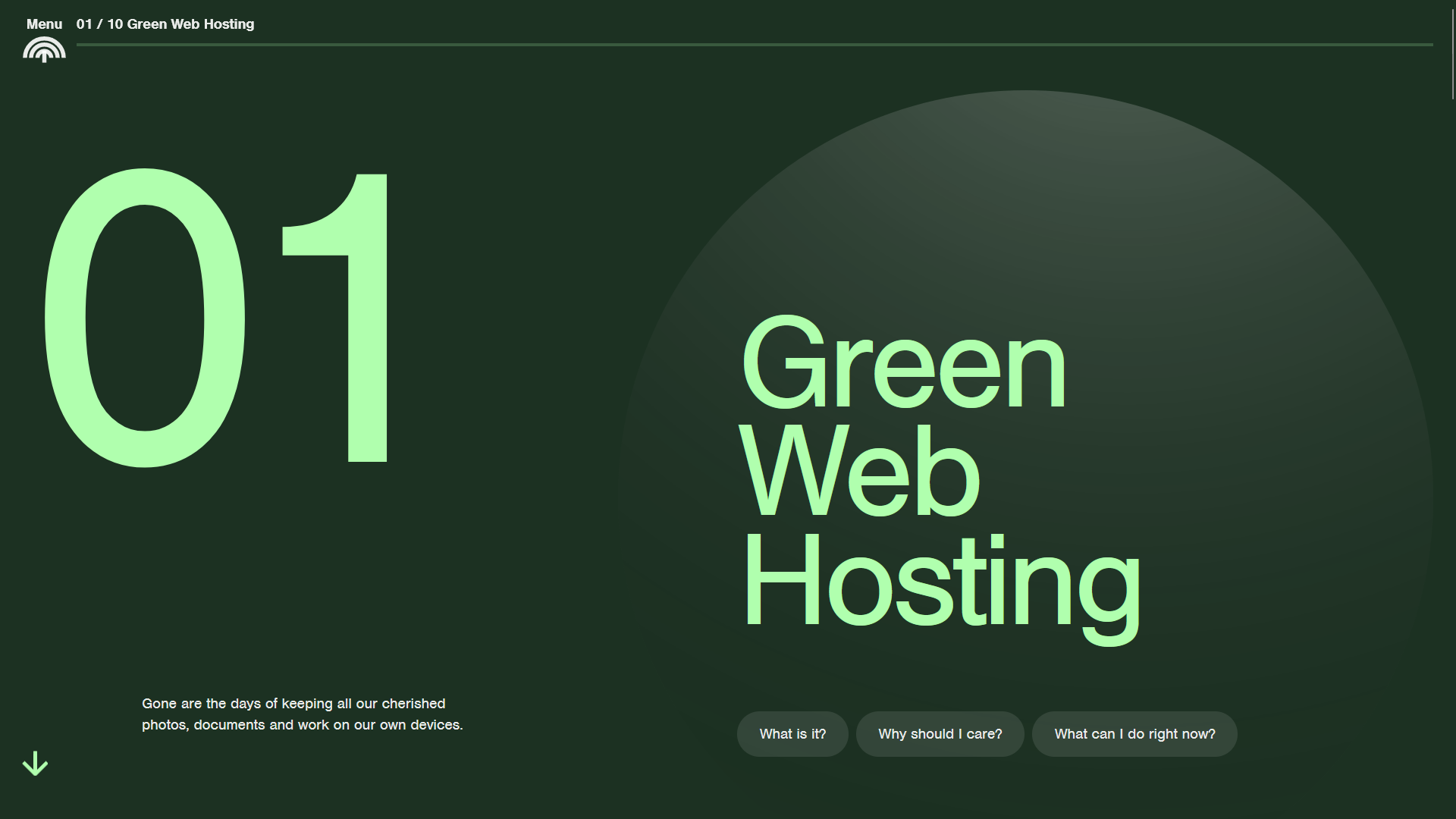
During the design phase it was noted that we wanted to provide the best practice with eco-conscious and accessible design. Therefore we planned to include a dark and light mode in the website which allowed the user to change and set the theme of the website to a dark theme which helped reduce the amount of carbon emissions emitted from the LED screen, or light mode where it would showcase the information in a bright and beautiful colourful page.
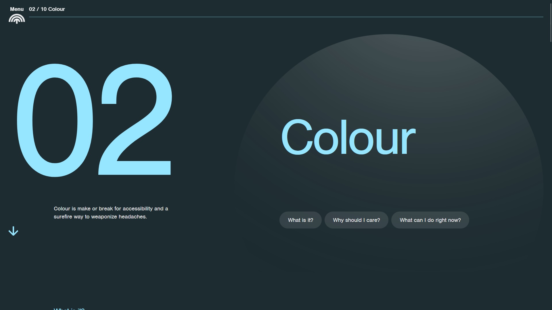
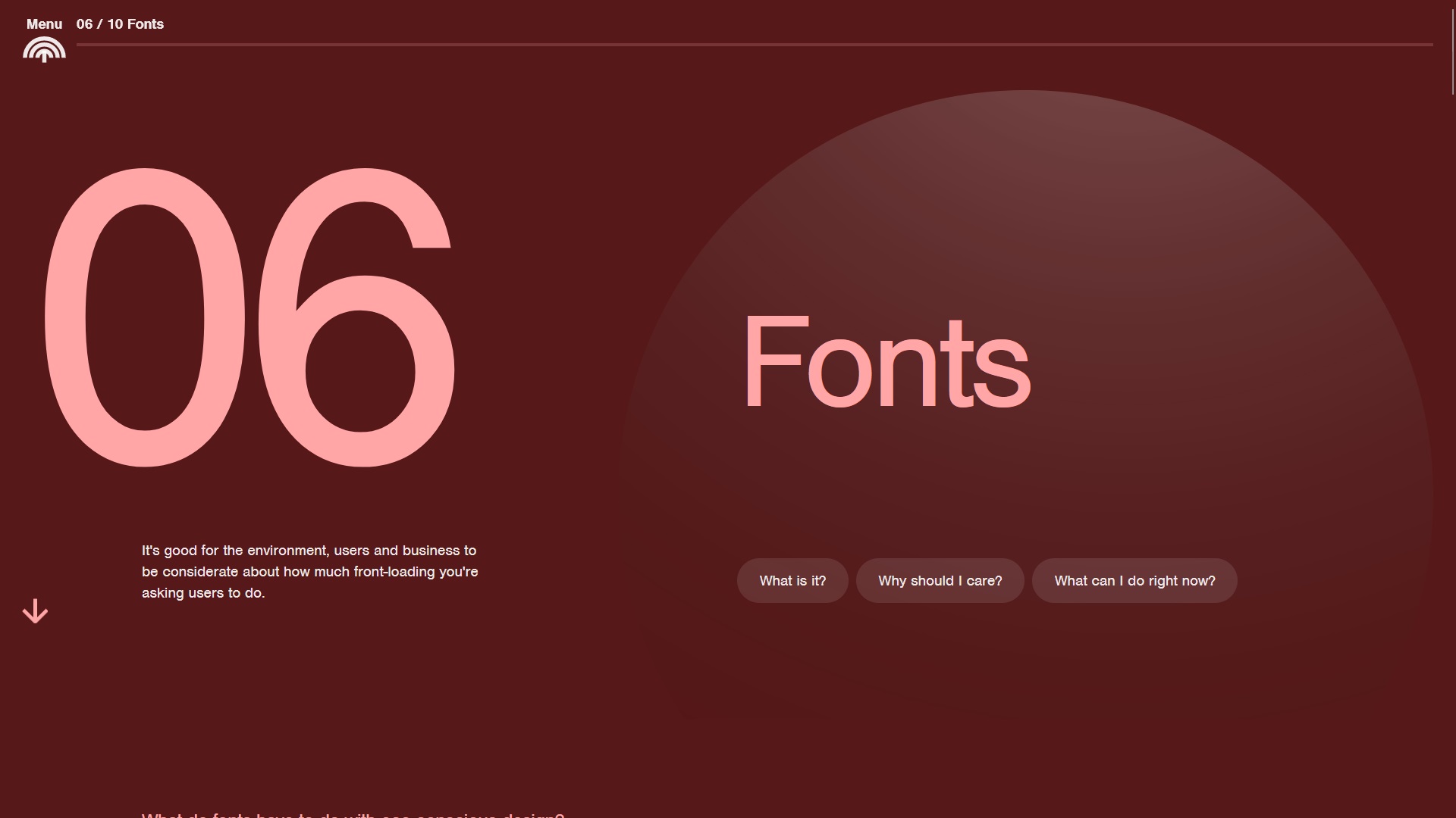
A toggle button was added to the menu where the user could easily select if they wish to change the theme to help reduce their carbon emission. The dark theme incorporated the bright green and black visual identity of the brand. Else a specific colour contrast was set per page topic.

GSAP was implemented to help give movement and animations to the page as the user scrolls. Prior to this, a moving 3D texture was originally designed but due to a high GPU usage to render the background, this was quickly dropped and a simple yet elegant version was used instead.
Now, our pages are smooth and stylish without putting too much strain on user's computers. Sometimes, less is more.
In order to incorporate a diverse spectrum of colors, our designer meticulously selected WCAG compliant and accessible colors across various shades for each topic. These hues were systematically applied throughout the website's development, contributing to enhanced visibility and perceptibility of information.
For each topic, a thoughtfully chosen background color harmonized with a complementary main color, accompanied by either off-white or black text. This strategic use of a lighter color palette for titles, buttons, and hover effects served the dual purpose of aesthetic appeal and effective differentiation of textual elements. This meticulous approach not only ensured visual vibrancy but also adhered to accessibility standards, promoting an inclusive and user-friendly design.